
In our previous series on TensorFlow, we explored how neural networks such as LSTMs (Long Short-Term Memory networks) can be used to learn a sequence of time series data, and forecast into the future. This forecasting has a variety of uses – for one, model predictions can be published, such as for weather forecasts. These predictions can also be compared against live data to determine if any anomalies, or deviations from the normal sequence, have occurred. This has tremendous use across any number of datasets – detecting fraud in finance, risks in health data, weather events, and more.
While bespoke TensorFlow models can be well tailored to a specific dataset and situation, building these models is time-intensive and requires machine learning knowledge to reach a good solution. Choosing loss functions, tuning parameters, normalizing data, and more quickly add up when trying to build a seemingly simple machine learning model. In many cases, existing services and models that are specialized for certain tasks will be far more efficient to get up and running. Many of these services have APIs that allow for low-code or even no-code solutions, making them great for plugging into existing applications.
One of these services is Microsoft Azure’s Anomaly Detector, which specializes in detecting spikes, dips, and other deviations from a time-series dataset. Anomaly Detector was released in 2019, but it existed internally at Microsoft for years before, and its algorithms have been trained on millions of time series to be fine-tuned before public release. Let’s test this service with some datasets and see how it goes!
Setting up the Anomaly Detector
Getting the detector up and running is a breeze, and can be watched in this walkthrough. After creating an Azure account, simply go to portal.azure.com, click “Create a Resource”, and search for “Anomaly Detector”. Be sure you select this option as opposed to “Edge Module – Anomaly Detector”. Assuming you haven’t created an Azure resource before, you’ll be able to use the F0 free pricing tier, which supports 10 API calls per second, far beyond what many R&D applications will require.
With our Azure resource up and running, let’s go through the default tutorial to ensure the API’s working correctly. To get things going quickly, our code will begin from Microsoft’s example code linked here. We’ll test this code and make updates using Google Colab, which allows us to write and execute Python code in a web browser. To follow along, you can view our Colab notebook here.
We begin by setting our API endpoint and key. In the Azure portal, head to “Keys and Endpoint” to retrieve these and save them as variables in your notebook. We then import the various python libraries we’ll be using, as follows:
- Requests: easily send HTTP requests via
request.post/patch/get/etc() - Json: convert a python object to a JSON object via
json.dumps(), and convert JSON to python usingjson.loads() - Pandas: a popular package for data manipulation, analysis, and plotting
- Numpy: a computing package specializing in multi-dimensional arrays
- Bokeh: create interactive graphs and visualizations
Testing with Example Data
The Anomaly Detector API has three main endpoints:
- Entire: detect anomalies through the entire time series
- Last: determine if your latest data point is an anomaly
- Changepoint: find points in the time series where the overall trend changes
For our tests, we’ll be focusing on the “entire” endpoint. Hitting this endpoint is as simple as calling the following, with the API key passed into the header:
endpoint = 'your_service_url/anomalydetector/v1.0/timeseries/entire/detect'
headers = {'Content-Type': 'application/json', 'Ocp-Apim-Subscription-Key': apikey}
response = requests.post(endpoint, data=json.dumps(request_data), headers=headers)
The API expects the request data in the following format:
{
  "series": [
    {
      "timestamp": "2017-01-01T06:45:00Z",
      "value": 1639196
    },
    …
    {
      "timestamp": "2017-01-01T06:50:00Z",
      "value": 1639290
    }
  ],
  "granularity": "minutely",
  "customInterval": 5,
  "period": 0,
  "sensitivity": 0.99
A breakdown of these request variables are as follows:
- Series (required): the time series as an array of hashes, each containing a timestamp and value.
- Granularity: the time granularity of the data, from yearly to secondly, used to verify that the timestamps in the data are evenly spaced.
- CustomInterval: customize the granularity. For instance, 5 combined with an hourly granularity means the timestamps are spaced every 5 hours.
- Period: the periodic value of the time series. For instance, hourly data is grouped into days, or 24 hour periods. This value can help the model with detecting seasonality, but it will do so automatically if no period value is provided.
- Sensitivity: by increasing sensitivity, you decrease the margin of difference that will be detected as an anomaly.
Now let’s see how the Anomaly Detector performs with some default data. After downloading the sample dataset from here, we can upload it to our Colab notebook with the following:
from google.colab import files
files.upload()
When then run the “build_figure” functions provided in Microsoft’s example notebook, and get the following:
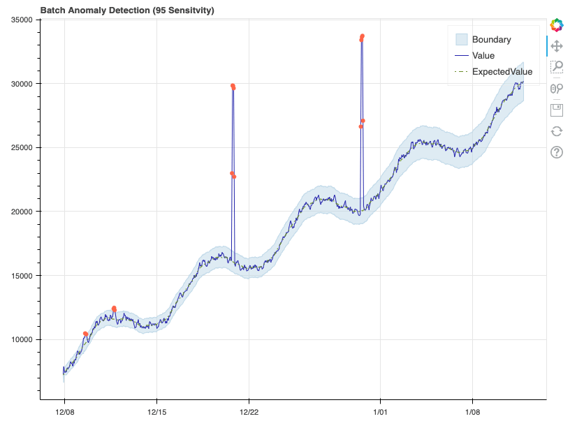
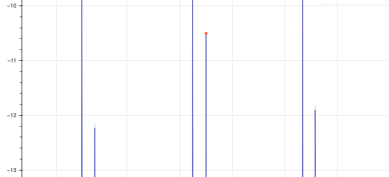
This example data has a clear, linear upward trend, in addition to a consistent seasonal curve that repeats each week. As such, the model did an excellent job of learning the sequence, with the expected value almost never deviating from the true value. Each data point marked as an anomaly can be seen as an orange dot. The boundary represents the upper and lower margins beyond which a data point is considered an anomaly. Given we set sensitivity to 95, this margin is quite narrow, and we see that some data points in the first week just barely get labeled as anomalies. Let’s see how this changes when we reduce the sensitivity:
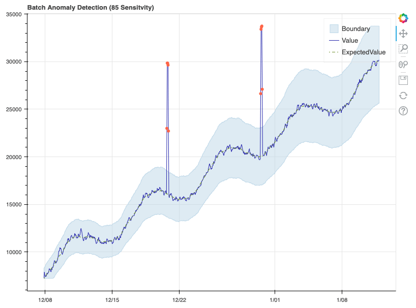
Here, the boundaries have widened significantly, and as a result only the two major spikes are detected as anomalies. Now that we’ve confirmed the detector is working properly, let’s format some real data and see how it performs.
Formatting our Real Data
To test the detector, we’ll be using some real-world temperature data from one of our OpSense sensors. This data is not as cleanly formatted as Azure’s example data, so let’s review some of the work done to format our data into the expected JSON format. We begin by uploading the OpSense data, which is stored as a CSV file. We then use Panda’s “read_csv” method to convert the CSV to a Dataframe object. Let’s take a look at how this data is currently formatted:
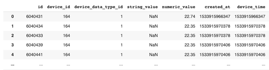
Each data point is from a single OpSense sensor, so we can ignore “device_id”. The “device_data_type_id” is also identical across the dataset, and all values are numeric. As such, we can begin by filtering down to only the “numeric_value” and “device_time” columns. You may notice that the “device_time” values are massive numbers – these are Epoch Unix timestamps, which represent the total number of milliseconds since the counter began in 1970. We can convert this to the timestamp format we saw in Azure’s example data using Pandas:
data['device_time'] = pd.to_datetime(data['device_time'], unit='ms')
After some additional reformatting, which can be seen in our Colab notebook, the data appears as follows:
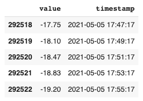
With a clearer view of the timestamps, we see that the data is being reported every 2 minutes. This will come in handy when we try setting our granularity for the Anomaly Detector. Let’s make a quick plot of this data to see what we’re dealing with:
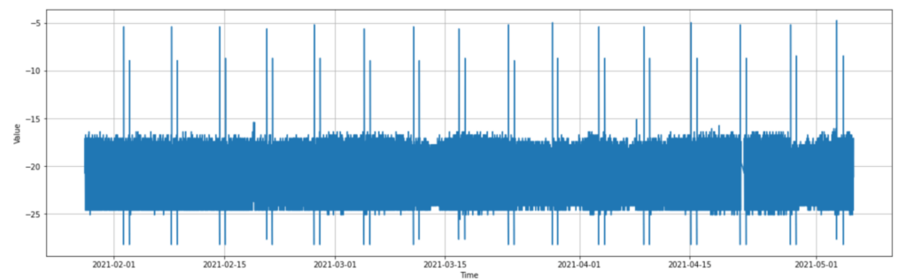
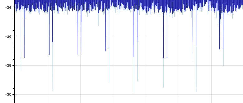
As can be seen, the data appears to jump between -24 and -17 for the most part, with consistent spikes up to almost -5, and down to almost -29. From now on, let’s refer to the upward spikes as “hot spikes”, and the downwards as “cold spikes”. If we look into the data more, we notice that these sets of spikes happen at a very consistent interval of every week, and there are 2 hot and 2 cold each week. With the context of this temperature sensor being in a freezer, and the values being in celsius, we can surmise that these consistent weekly spikes are due to some mechanical cycle in the freezer, in this case a defrost cycle.
Given their consistent seasonality, it would actually be ideal if these spikes are not considered anomalies, however with how quick and extreme the spikes are, it wouldn’t be a huge surprise if the Anomaly Detector still marks them as such. To get a better look at the data, let’s take a quick look at the final week of data:
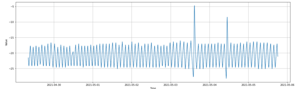
With this finer detail, we see that the temperature constantly vacillates up and down 12 times each day like a triangle wave, with the spikes happening once a week about 18 hours apart. This wave pattern is extremely consistent, so we should expect the Anomaly Detector to learn the pattern, and not view anything outside the spikes as an anomaly, even when sensitivity is set very high. We can also see here that the 2 cold spikes occur immediately before the hot spikes, as though they’re part of the same wave.
Let’s return to our data formatting. While the value and timestamp values are looking good, there’s one big problem: we have 69559 rows of data. This became an issue later on, as the Anomaly Detector only accepts up to 8640 data points when hitting the “entire time series” API call. To address this, we’ll convert our data to make each data point a “rolling average” of the previous 10 points. We’ll then filter down to each 10 data points, reducing our data set to 6956 points:
final_data_rolling = final_data
final_data_rolling['value'] = final_data_rolling['value'].rolling(10).mean()
final_data_rolling = final_data_rolling.iloc[::10, :]

len(final_data_rolling.index)
> 6956
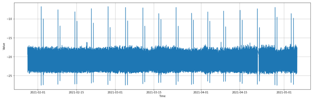
If we re-plot the new rolling data, it appears almost identical to the original plot, with the weekly temperature spikes still intact. One could almost be convinced the plots are identical, however the spikes no longer go as far, now reaching about -9 degrees at their hot peak.
Finally, let’s convert our data to a JSON object to be sent to the detector endpoint. We again use the json.loads() and json.dumps() methods to convert our data from a Pandas Dataframe to a JSON object:
final_data_to_json = final_data_rolling.to_json(orient="records", date_format='iso', date_unit='ms')
final_data_to_json = json.loads(final_data_to_json)

opsense_json = json.dumps({"series": final_data_to_json, "granularity": "minutely", "customInterval": 20})
opsense_json = json.loads(opsense_json)
When setting up our final “opsense_json” object to hit the endpoint with, you’ll notice that we’ve set the granularity to “minutely” and the customInterval to 20. This is because our rolling data has a timestamp of each 20 minutes instead of the previous 2, as seen here:
[{'value': -19.396, 'timestamp': '2021-01-28T08:52:23.000Z'},
 {'value': -17.511, 'timestamp': '2021-01-28T09:12:23.000Z'},
 {'value': -19.591, 'timestamp': '2021-01-28T09:32:23.000Z'},
 {'value': -22.838, 'timestamp': '2021-01-28T09:52:24.000Z'},
Testing with Real Data
With everything formatted correctly, let’s send it off and see what plot the detector returns!
build_figure(opsense_json,85)
Unfortunately we’re not quite there yet. This call returned the following error:
{"code":"InvalidSeries","message":"The 'timestamp' at index 3 is invalid in minutely granularity with 20 gran as interval."}
If we look at the data printout above, we see that at index 3, or the 4th row of the data, the timestamp ends with 24 seconds, while the previous three rows ended with 23 seconds. This shows just how specific the detector is about time granularity by default. Thankfully, there’s an easy enough workaround here. Granularity is not a required field for the API, and if it’s not provided, the Anomaly Detector assumes that all of the timestamps in the data are equally spaced. Given we’re pretty confident in our data’s consistency, we can simply drop the granularity and customInterval arguments, and send the request again. This time, we have a successful response!
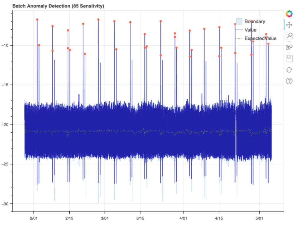
The detector performed pretty close to expectations, not calling out any of the normal daily values as anomalies, but marking most of the weekly hot spikes. Interestingly, some of the 2nd, less intense weekly hot spikes are not marked as anomalies, and none of the cold spikes are marked either. If we zoom into the plot, we can get a view of the boundaries around these spikes. Let’s look at the hot spikes first:
You’ll notice a very faint blue line that extends beyond the 1st and 3rd spike here, while the 2nd is marked as an anomaly. If we then look at the cold spikes, we see that the boundary always exceeds the spike, and 2nd cold spike boundary each week appears excessive, going well beyond the true spike on average:
Looking more closely at the data, we notice a few patterns. The detector’s boundary for each 2nd cold spike has almost the same magnitude as the 2nd hot spike. The detector likely learned that there’s a hot/cold pattern in these spikes, and successfully predicted these cold spikes, but on average overestimated how cold they’d get.
Conclusion
Overall, the results here are very impressive. The OpSense dataset’s hot and cold spikes were significant and sudden, and the detector’s ability to predict each spike, as shown by the plot’s boundaries, shows that it was quite successful in learning the weekly spike pattern. While the 1st hot spikes of each week triggered anomalies, additional training data or normalization of the data may help the detector recognize these spikes as seasonal. While the API was somewhat restrictive in how its request data should be formatted, the ease of hitting the endpoint and instantly getting results is a very attractive option against building a custom model in TensorFlow.
In the future, we’ll continue to explore the Anomaly Detector’s performance on different datasets, and also look into Azure’s other AI Services, which extend well beyond the detector. The Azure Data Explorer, for instance, features its own anomaly detection and forecasting features, and when searching through Azure’s other services in the web portal, it was shocking how many other services looked relevant to these time series problems.

About Mission Data
We’re designers, engineers, and strategists building innovative digital products that transform the way companies do business. Learn more: https://www.missiondata.com.