The asphalt material association’s new platform is an industry game-changer

Five years ago, Mission Data built a brand new SaaS platform for Asphalt Institute, a U.S.-based international trade organization promoting quality management for construction materials laboratories.
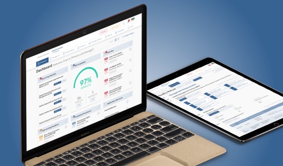
The platform, called R18LabQMS, provides a simple and efficient way for customers to manage their laboratory equipment, processes, staff, and complex regulatory processes. The platform also provides a revenue stream for Asphalt Institute, and includes nearly 100 labs, with subscribers in nearly 40 states across the U.S. as well as much of Canada.
Over time, additional features and functionality refinements were added to that original platform in a series of releases. The five-year anniversary roughly coincided with version 2.0 of the platform, and to mark the occasion, Mission Data undertook a major UX refresh of the entire application, adding even more capabilities while unifying all of the app’s features within a consistent structure and set of interface patterns.
 Asphalt Institute’s dashboard pre-redesign.
The UX Refresh Challenge
The existing version of Asphalt Institute’s platform, while initially well-designed, had started to look outdated, and the navigation for some tasks had become cumbersome or awkward. Additionally, many new features had been essentially “bolted on” in inconsistent ways. Asphalt Institute wanted to improve the overall experience for both the end-users, as well as significantly expand and improve functionality for administrators of the system.
The Solution
The UX refresh for the new platform started with a discovery day where the Mission Data team (Project Manager, Programming, and UX) met with the Asphalt Institute stakeholders and went over all the major parts of the old application to identify pain points and improvement opportunities.
Over the following several months, the teams worked together to:
- Improve navigation and more readily expose primary functionality
- Create a highly customizable new dashboard
- Build new UI patterns for editing information in place — saving the users a lot of clicks and increasing the application response and the perceived performance
- Standardize the existing UI patterns to clear ambiguity when using the application
Results
The new platform supports subscription management; role-based access, workflow, document creation; and complex management of equipment inventory, testing procedures, and employee performance tracking. Five years of functionality were unified within a small and well-defined set of UI patterns, giving users predictable workflows for performing the tasks required to keep their labs compliant. And the robust new dashboard provided new ways for individual users to quickly surface the data most relevant to their needs.